空白的嚮應式網站架構
- 下載Bootstrap
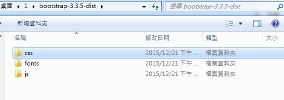
- 將檔案解壓縮,結構為:
<!DOCTYPE html>
<html  lang= "zh-TW" >
<head>
<meta  charset= "utf-8" >
<meta  http-equiv= "X-UA-Compatible"  content= "IE=edge" >
<meta  name= "viewport"  content= "width=device-width, initial-scale=1">
<!--上述3個meta標籤*必須*放在最前面,任何其他內容都*必須*跟隨其後!-->
<title> 網頁標題 </title>

<!-- Bootstrap -->
<link  href= "css/bootstrap.min.css"  rel= "stylesheet" >

<!-- HTML5 shim and Respond.js for IE8 support of HTML5 elements and media queries -->
<!-- WARNING: Respond.js doesn't work if you view the page via file:// -->
<!--[if lt IE 9]>
  <script src="//cdn.bootcss.com/html5shiv/3.7.2/html5shiv.min.js"></script>
  <script src="//cdn.bootcss.com/respond.js/1.4.2/respond.min.js"></script>
<![endif]-->
</head>
<body  id="page-top">

<!-- jQuery (necessary for Bootstrap's JavaScript plugins) -->
<script src= "//cdn.bootcss.com/jquery/1.11.3/jquery.min.js" ></script>
<!-- Include all compiled plugins (below), or include individual files as needed -->
<script src= "js/bootstrap.min.js" ></script>
</body>
</html>
空白的區段容器
<!-- 區段容器-->
<section id="reply" class="padded-section">
<div class="container">
  <!--區段標題-->
  <div class="row">
    <div class="col-md-12">
      <div class="center-heading" style="text-align: center; margin-bottom: 40px;">
        <h2>區段標題</h2>
        <hr>
      </div>
    </div>
  </div>
  <!--區段標題 end-->
  <!--區段內容-->
  <div class="row">
    <div class="col-sm-12 col-md-12">
      <!-- 內容-->
      <!-- 內容end-->
    </div>
  </div>
  <!--區段內容 end-->
</div>
</section>
<!--區段容器 end-->